Dashboards are useful for customizing the display of data to a user. It is used to highlight interesting and useful aspects of data, link to important searches, and display common reports.
SSRS dashboard contains different types of
visualization which display certain metrics on some dimensions or reports. The
metrics can be changed by using filter conditions on above display panel. Each time
we change the filter conditions it is going to strike the database and fetch
the data for that filter. We can also give dynamic link to another report.
Charts :
A chart is a graphical
representation of data, in which "the data is represented by symbols, such
as bars in a bar chart, lines in a line chart, or slices in a pie chart".
A chart can represent tabular numeric data, functions or some kinds of
qualitative structures.
The term
"chart" as a graphical representation of data has multiple meanings:
·
A data chart is a type of diagram or graph, that organizes and
represents a set of numerical or qualitative data.
·
Maps that are adorned with extra information for some specific
purpose are often known as charts, such as a nautical chart or aeronautical
chart.
·
Other domain specific constructs are sometimes called charts, such
as the chord chart in music notation or a record chart for album popularity.
Charts are often used to
ease understanding of large quantities of data and the relationships between
parts of the data. Charts can usually be read more quickly than the raw data
that they are produced from. They are used in a wide variety of fields, and can
be created by hand (often on graph paper) or by computer using a charting
application. Certain types of charts are more useful for presenting a given data
set than others. For example, data that presents percentages in different
groups (such as "satisfied, not satisfied, unsure") are often
displayed in a pie chart, but may be more easily understood when presented in a
horizontal bar chart. On the other hand, data that represents numbers that
change over a period of time (such as "annual revenue from 1990 to
2000") might be best shown as a line chart. It
is important to carefully prepare and understand your data before you create a
chart, as this will help you design your charts quickly and efficiently.
The
following illustration shows many of the different elements used in the chart:

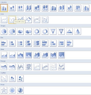
SSRS supports various kinds of charts like:
·
Column Charts
·
Line Charts
·
Different Shapes
·
Bar Charts
·
Area Graphs
·
Range Graphs
·
Scatter Graphs
·
Polar Graphs
This figure will show all the possible charts in SSRS-2008:
Designing
a Chart:
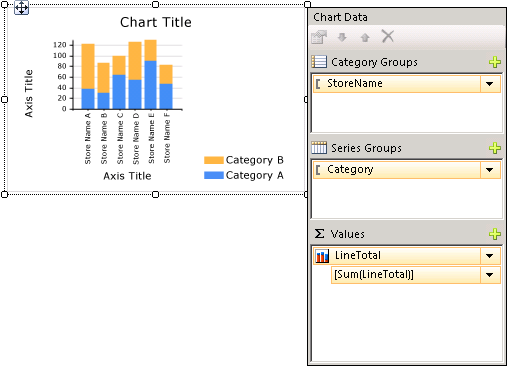
After you add a chart data region to the design surface, you
can drag report dataset fields for numeric and non-numeric data to the Chart
Data pane of the chart. When you click the chart on the design surface, the
Chart Data pane appears, with three areas—Category Groups, Series Groups, and
Values. If the report has a shared or embedded dataset, the fields in the
dataset appear in the Report Data pane. Drag fields from the dataset into the
appropriate area. By default, when a field is added to one of the areas of the
chart, Reporting Services calculates an aggregate for the field. You can also
use series grouping to dynamically generate series. The chart is also closely
related to the matrix.
Adding
Data to the Chart:
Suppose you have a report that shows Sales by Name. You drop
the Full Name field to the Category Groups area and the Sales field to the
Values area.
When you add the Sales field to the Values area, the text of
the data field appears in the legend, and the data from this numeric field will
be aggregated into one value. By default, the value is aggregated using the
built-in function Sum. The Chart Data pane will contain a simple expression for
your field. In our example, [Sum(Sales)] will appear for the field expression =Sum(Fields!Sales.Value).
If no groups are specified, the chart will only show one data point. In order
to show multiple data points, you must group your data by adding a grouping
field. When you add the Name field to the Category Groups area, a grouping
field of the same name as the name of the field is automatically added to the
chart. When fields that define the values along the x and y axes are added, the
chart has enough information to plot the data correctly.

When the Series Groups area is left empty, the number of
series is fixed at design time. In this example, Sales is the only series that
appears on the chart.
A chart supports nested category and series groups. Charts
do not display detail data. Add groups to a chart by dragging dataset fields to
the category and series drop zones for a selected chart.
Shape charts such as pie charts support category groups and
nested category groups. Other charts such as bar charts support category groups
and series groups. You can nest groups, but make sure that the numbers of
categories or series do not obscure the presentation of information in the
chart.
Adding Series Grouping to a Chart:
If you add a field to the Series Groups area, the number of
series depends on the data that is contained in that field. In our earlier
example, suppose you add a Year field to the Series Groups area. The number of
values in the Year field will determine how many series will appear on the
chart. If the Year field contains the years 2004, 2005, and 2006, the chart
will display three series for every field in the Values area.